Colours are subjective
Seeing and judging colours is very subjective - not everyone has the same favourite colours. Nevertheless, there are generally valid agreements in colour perception that all people share. This makes it possible to achieve a desired mood in the design. Blue, for example, calms and stimulates rational thinking, yellow is cheerful, lively and promotes creativity, green relaxes and red appears warm and generates activity.
Combining colours
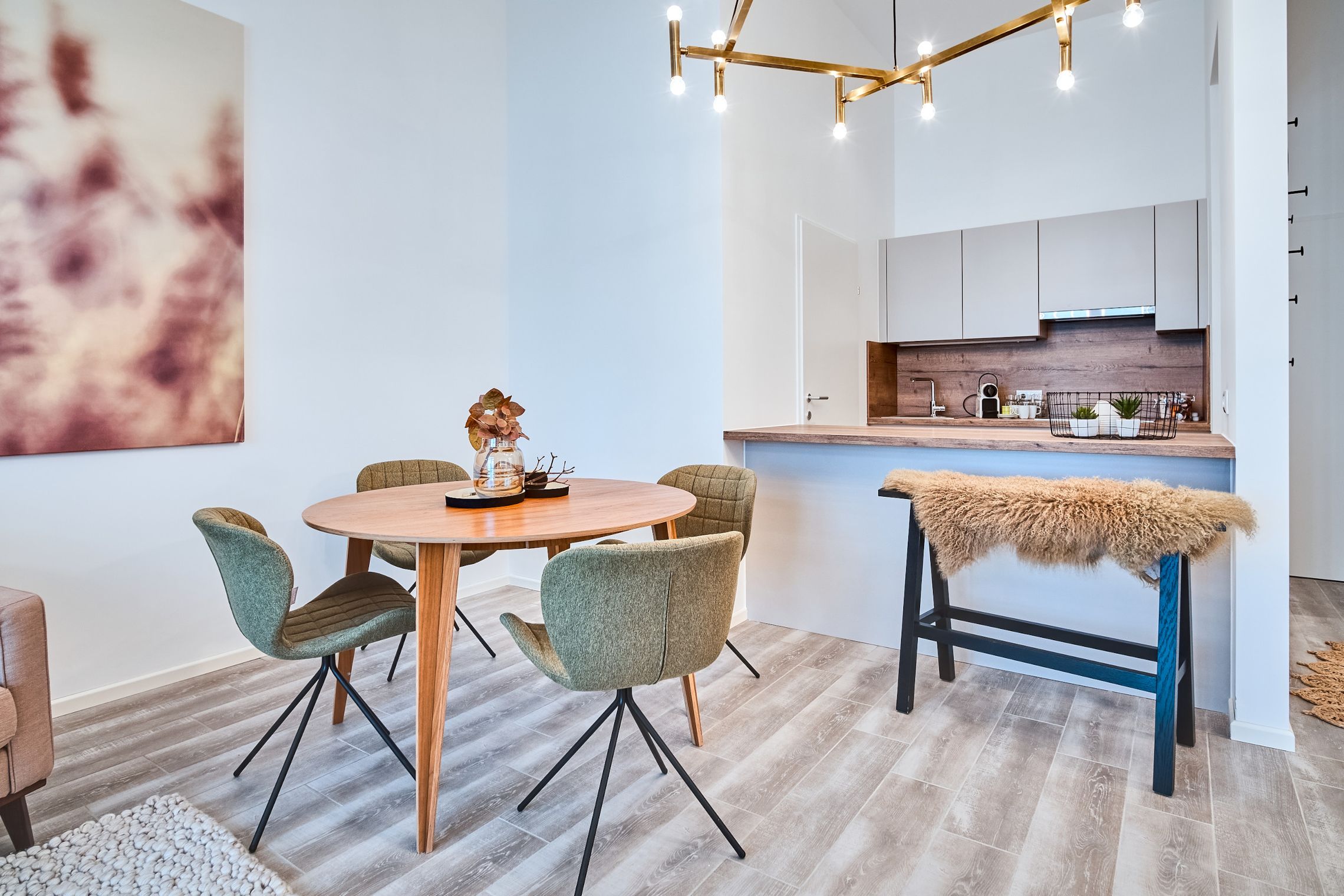
When combining, the imagination knows no bounds. In addition to the base colour, additional colours can provide further impulses. The simultaneous use of colours that lie opposite each other in the colour wheel creates strong contrasts that appear cheerful and powerful. Opposite colours can also be used to counteract the effect of a main colour. Colours that are similar to the main colour of a room, on the other hand, underline its effects. Such tone-on-tone combinations of neighbouring tones are rather calming, but also quickly become boring.
For mood and atmosphere
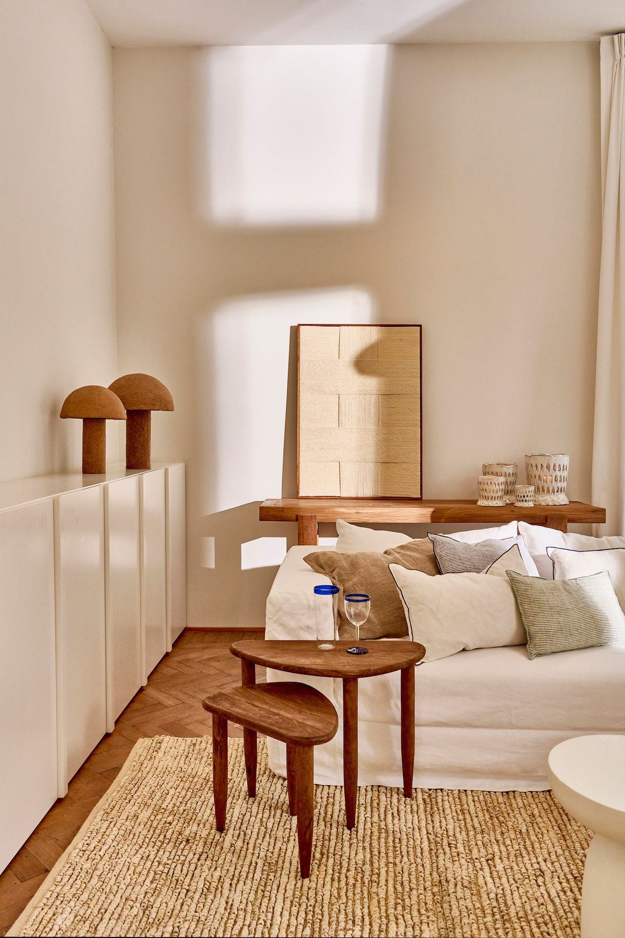
Warm colours such as brown, beige, yellow, orange and red make a room cosy. Green and sandy tones create a fresh, natural mood. A room, on the other hand, becomes original and dynamic through an unusual, imaginative colour scheme with clear contrasts. However, strong colour contrasts are not recommended for an elegant atmosphere. Grey and beige tones, tone-on-tone combinations and noble woods look elegant. A sober impression can be achieved with restrained, cool and muted colours, for example light blue, grey and white.
Space, function and colour
When designing colours, it also makes sense to pay attention to the function of a room. For example, the hallway should appear inviting, which is achieved with muted, warm colours. The living area should encourage a sense of well-being, which harmonious tone-on-tone designs contribute to, while in the bedroom, rest and relaxation come first, which can be achieved, for example, with blue tones and restrained, delicate colours. In a children's room, lively colours can be stimulating. In the kitchen, on the other hand, it all depends on whether it is only used for cooking or whether people also eat, relax and live there.
Large and small rooms
First and foremost, the choice of colour is a matter of personal taste and the mood desired for a room. But colours can also be used to visually influence the proportions of a room. Light tones make a room appear visually larger, while dark tones make it appear smaller. Light, bright colour tones convey spaciousness, making it airy and fresh, so that even narrow and small rooms appear larger in light colours. Lighter blue tones are particularly suitable for creating an impression of spaciousness. As blue is the colour of thinking and rationality, a light blue room gives space not only to the eyes, but also to the mind. The colour is therefore particularly well suited to the workroom. As yellow promotes creativity, the warm colour is the optimal complement for productive work.
For above and below
While dark ceilings weigh a room down, a light ceiling visually expands it upwards. However, since a dark floor conversely makes a room appear higher, a gradient of brightness from the ceiling to the floor works particularly well. Light colours are therefore suitable for the top, while richer colours are suitable for the bottom.
Factor time
In any case, sufficient time must be allowed for the selection of colours. It is worth letting the tones take effect on you, feeling them and becoming familiar with them. It is important to take the lighting conditions into account: it is best to choose the colours in the room in which they are later to take effect. It is also advisable to look at them at different spots in the room.
Feeling good all round
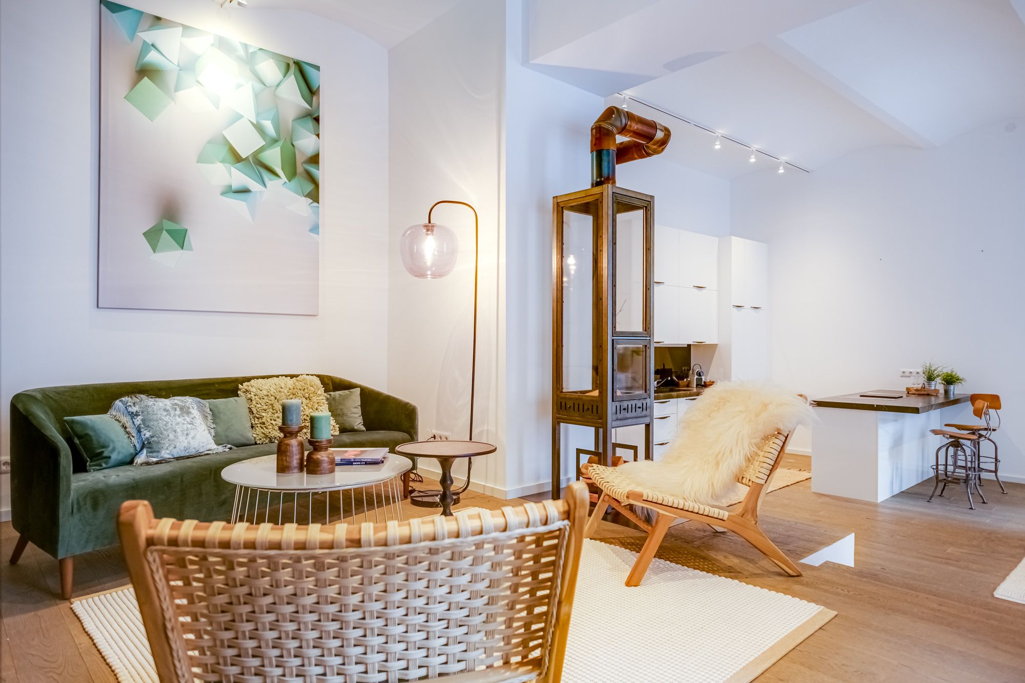
Objects such as furniture, curtains, tablecloths, pictures, lamps or cushions should also be included in the colour concept. Such accessories can be used to set beautiful contrasts and accents that can decisively underline the desired atmosphere. The imagination knows no bounds when it comes to the colourful design of your own four walls. And a bit of courage with colour is rewarded by a home where well-being is a matter of course.
We will gladly advise you at your home or in your office as well.
If you are interested: e-mail to office@wohnfee.at.